Tamzo - Rebrand
The main goal of Tamzo is to produce personalized portraits and illustrations allowing the customers to be included in the experience of creating something unique and made just for them. While looking into making the logo better relate to the craft and the idea of co-creation, the exploration studies took the logotype from its rigid form to a more fluid look.
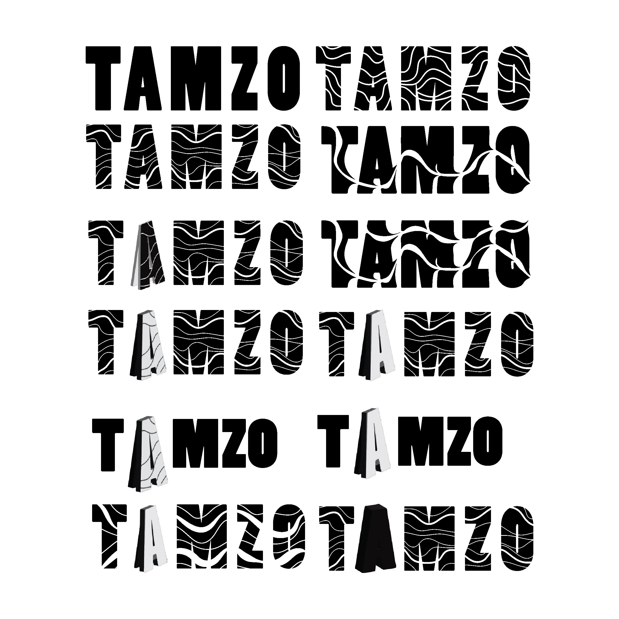
LOGOTYPE EXPLORATION STUDY
FINAL LOGOTYPE
The final iteration of the logo starts with the word Tamzo in the typeface Poplar Std Black. The word gets smudged by two traces as if a paintbrush was going across the letters. The traces represent the artist and the customer, hence why one is longer and the other is shorter, portraying the journey and process of each painting. While the artist takes control from beginning to end, the customer joins in for part of the journey.
The logo variations include a background or foreground color change according to the color palette. The color white is also part of the logo for every variation. The distribution is maintained throughout the different iterations.

APRON MOCKUP

ICONS + COLOR PALETTE

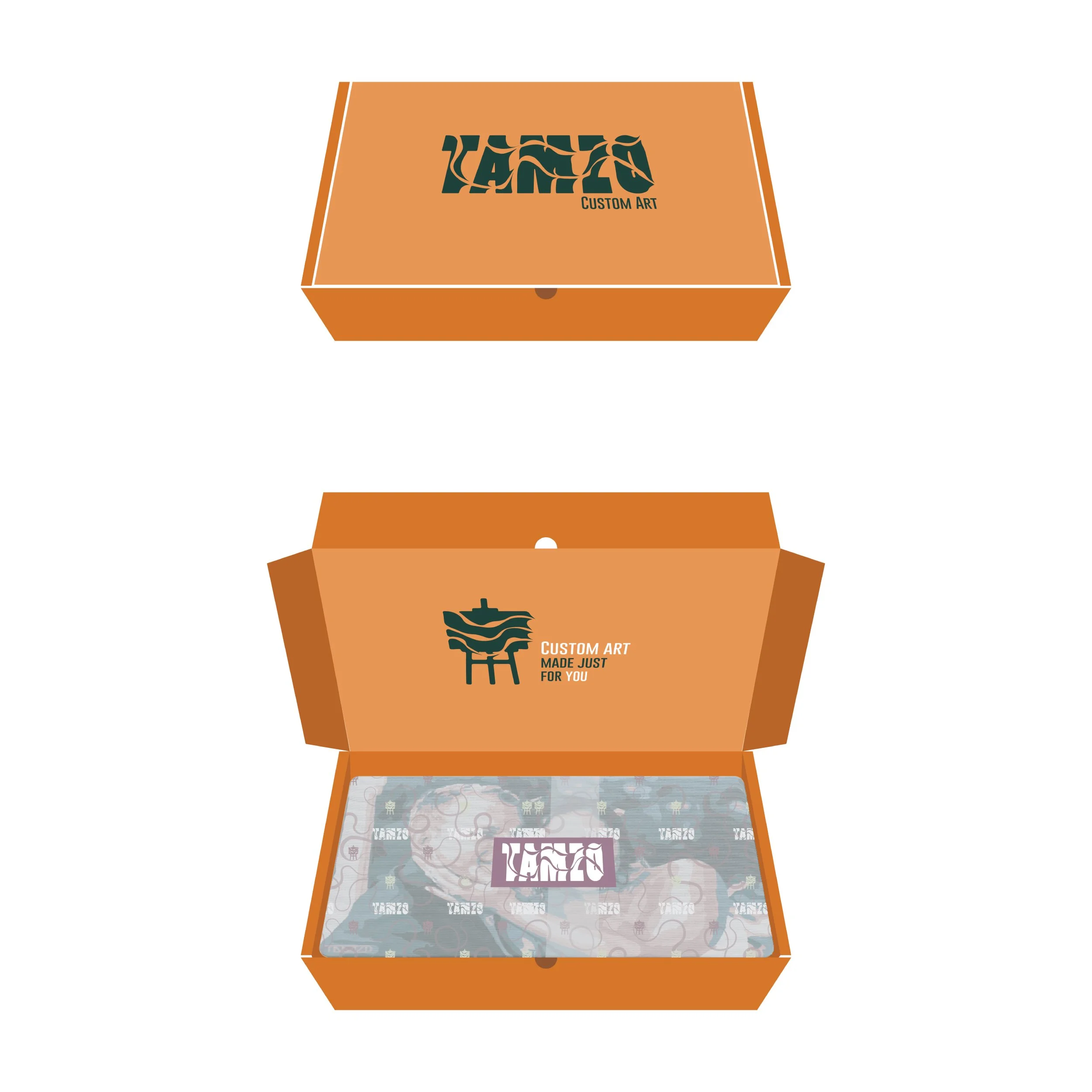
PACKAGING MOCKUP
BUSINESS CARD
Project details
Topic: Rebranding
Course: Intro to Graphic Design - Pratt Institute
Software: Adobe Illustrator - Photoshop